Are you a female founder or small business owner looking to elevate your website without breaking the bank? With a little bit of guidance, designing and launching a beautiful website can be done at an affordable price. A modern-looking website allows customers – old, new, and potential – to connect with your brand in ways that weren’t previously possible. Whether it’s showcasing a portfolio of works, selling products online, or providing valuable industry knowledge through blogging, there are many elements that contribute to creating an aesthetically pleasing and highly functional website within your budget. This guide provides creative advice on how to design the best possible version of your dream website while staying within the resource limits you have available.
Disclaimer: I’ll be sharing my favorite digital products and resources that I use and recommend to my clients to help you create your own website on a budget throughout this blog post. Some links may be affiliate links which means I may make a small commission at no extra cost to you if you decide to make a purchase using my link. PLUS you’ll usually get a sweet little discount. Rest assured, I only recommend products I absolutely love! I am so grateful for your support of my small business.

Start with a Plan
Starting a new website can be intimidating. With so much to consider, it’s easy to feel overwhelmed and unsure of where to begin. But taking the time to start with a plan is crucial.
Choose your website platform
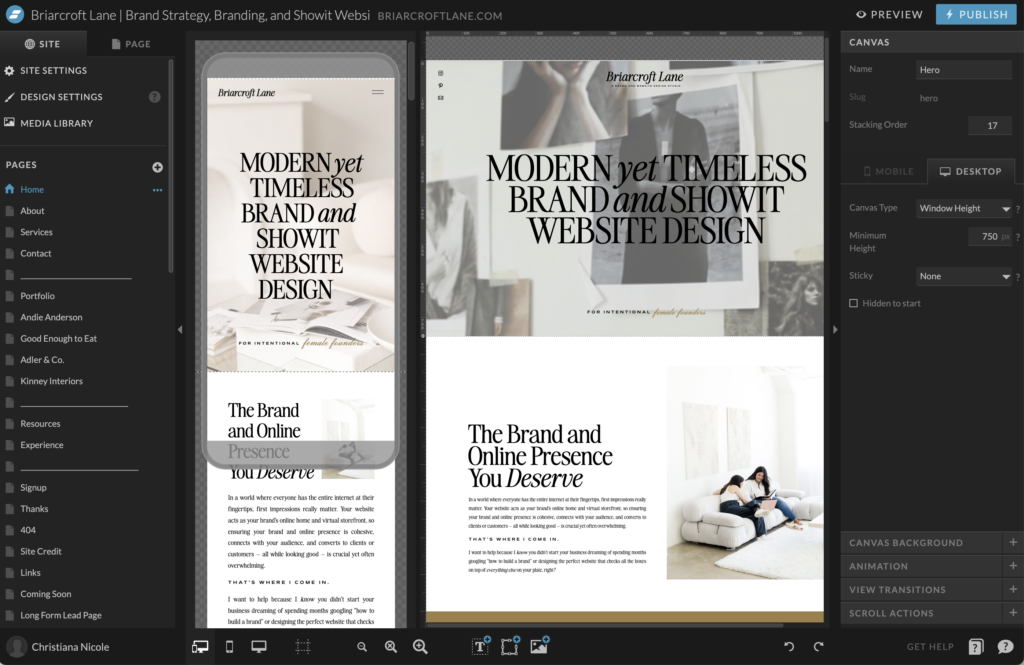
Think about what platform you’ll choose to build your platform on – WordPress, Showit, Squarespace, Wix, etc.? As someone who has truly tried them all, I highly recommend Showit for the business owner who really values design and freedom when building their website but doesn’t have the time to figure out how to code. I learned the fundamentals of Showit in a quick afternoon with their free online course you can complete in under two hours. It is by far the most intuitive website platform I have used and you have complete creative freedom. You can try Showit for a month free here or with code briarcroftlane!

Choose content that supports your overall goal.
You’ll also want to decide which pages you need, and what content you want to showcase. Think about the kind of images you’ll feature, will you have brand photography taken or will you rely on high-quality stock photography? (I recommend Haute Stock for curated editorial stock images and videos– save 15% with code briarcroftlane – and Pexels for free high-quality stock images and videos.)

Decide on the layout and navigation
Consider the layout and navigation of your site, and make sure it’s easy for visitors to find what they’re looking for. And, of course, all of this should support your overall goal. Whether you’re looking to sell products, promote your brand, or simply share your thoughts with the world, having a clear plan will help you accomplish your objectives. So take a deep breath, grab a notebook, and start mapping out your vision for the perfect website. Your future self – and your future visitors will thank you.
P.S. Looking for some help in the planning department? I highly recommend Between the Lines Copywriting’s Wicked Easy Web Copy Guide. I used it to write my own website copy and can confirm it is worth every penny and more! Saffron Avenue, who I purchased my website template from, has a website content planner that I haven’t used, but have heard wonderful things about!
Choose a Template
Select a design-forward and strategic website template that fits your brand and budget.
Choosing the right website template for your website is crucial when it comes to making a lasting impression online. It’s not just about aesthetic appeal, your website’s template should also match the messaging and branding of your business.
I recommend two different Showit template shops to my clients and I’ll share them with you too. I’ll be honest with you, these are not cheap website templates but for good reason. I am a firm believer that if there is anywhere you should spend majority of your budget when building your website, it should be on the website template. A style-forward, strategic, and conversion-driven website template is the difference between someone saying “I can’t believe you created your website yourself!” and not feeling confident in your new site. I recommend these two website template shops because time and time again, the finished product ends up looking so custom, people won’t believe you started with a template.
Tonic Site Shop
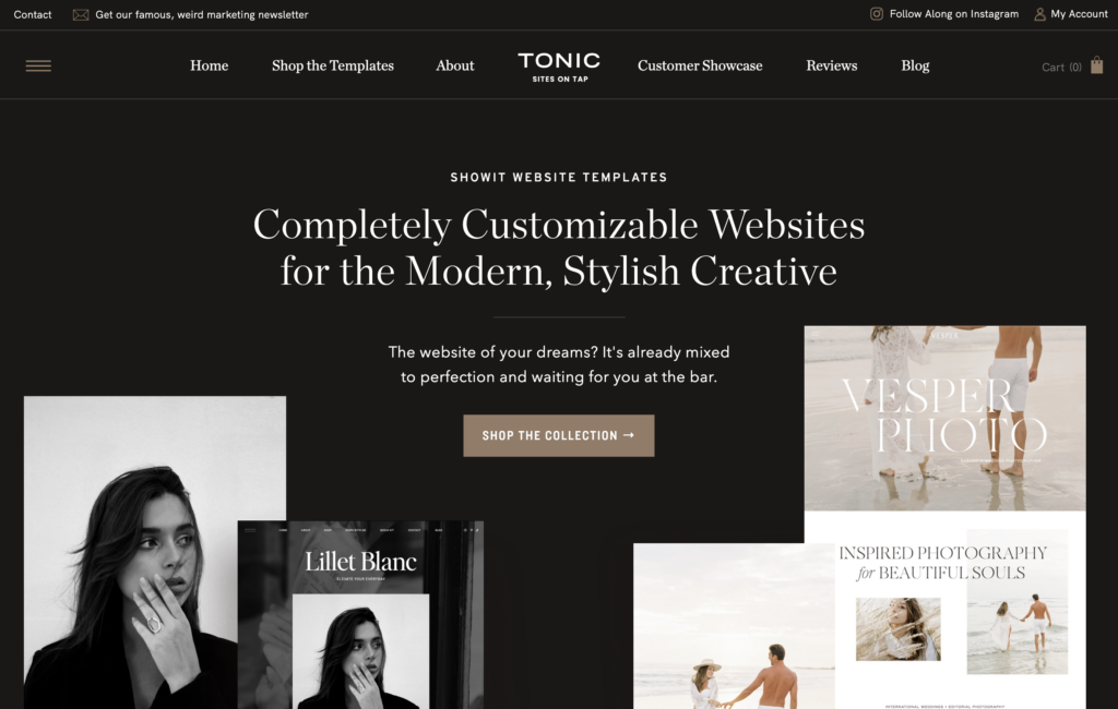
First up is Tonic Site Shop. Tonic offers conversion-driven design templates that are both stunning and strategically designed to help you achieve your business goals. With Showit website templates as their specialty, Tonic Site Shop ensures that your website is not only visually appealing but also built to convert visitors into customers. They have several different design styles across their 14 website templates along with sales pages to match.

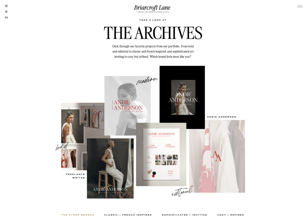
When choosing my website template for my own website, it was neck and neck between Tonic’s Lillet Blanc and Saffron Avenue‘s Palma website template. I would love an excuse to customize the Lillet Blanc template for a client one day *hint hint*! My other Tonic favorites are French 75, Greyhound, and the Moodboard website add-on (take a peek below to see how I used it on my services page to feature brands from my portfolio). I also love their social media templates. Clean, modern, and they make me actually enjoy creating social media content – I own every pack if that tells you anything!
You can save 15% on any Tonic Site Shop purchase with code briarcroftlane15.

Saffron Avenue
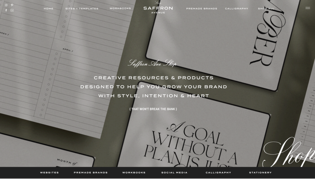
Saffron Avenue is who I ended up going with for my own website template, and I am so so happy with it. I chose Palma because it has everything on my list and the design felt so aligned with what I wanted for my website. I also love Riviere and Jardin. Saffron Avenue also offers a website content planner and a launch planner, I highly recommend them both especially if you are going the do-it-yourself route! I used the launch planner for my own website launch.
You can save 10% on any Saffron Avenue purchase with code briarcroftlane.

Finding the right template can be overwhelming, but with Tonic Site Shop’s and Saffron Avenue’s expertly crafted options, you can take a sigh of relief knowing that you are starting your website design journey with a strong – and strategic – head start.
Keep it Simple
Don’t overcomplicate things by adding too much content, graphics, and other elements to the site. Keep it clean and minimalistic.
In a world where we’re constantly bombarded with information, it can be easy to fall into the trap of thinking that more is better. But when it comes to designing a website, less is often more. By keeping things simple and minimalistic, you can create a site that is both visually appealing and easy to navigate. Instead of overwhelming your visitors with too much content or too many graphics, focus on creating high-quality images and thoughtful content that will resonate with your audience. Remember: it’s always better to prioritize quality over quantity when it comes to website design. By taking a measured, thoughtful approach, you can create a site that truly stands out and captures the attention of your target audience.
Focus on Navigation
Make sure visitors can easily navigate through all areas of the website without becoming lost or confused.
Navigating through a website can be frustrating, especially when visitors can’t find what they’re looking for. Improving user experience requires a focus on navigation. The homepage is the map to the rest of your site. It’s where potential customers come to learn more about your product or service and where to go next. Make sure your homepage’s design is simple and uncluttered, guiding visitors to the action you want them to take. Whether it’s to sign up for a newsletter, browse your product catalog, or explore your services, your call to action should be clear and easy to find. By prioritizing clear navigation, you’ll keep visitors engaged and showcase what makes your business stand out from the competition.
Test Your Website Before Going Live
Test every page of your website to make sure everything is working properly before you launch it to the public.
Launching a website to the public is such an exciting experience, but it can quickly turn into a nightmare if things go wrong. That’s why it’s important to test every page of your website before going live.
Take the time to check site speed, perfect your content, and scan for broken links. Check that your embedded email marketing forms are showing up correctly and work like they should. You don’t want potential customers clicking off your website before they even get a chance to see what you have to offer.
And before you hit the “publish” button, send your site to a friend to proofread. Sometimes, an extra pair of eyes can catch mistakes or confusing language that you might not notice yourself. Trust me, putting in the effort to make sure your website is running smoothly will pay off in the long run and make launch day so much less stressful!

Monitor Performance
Track how visitors interact with your site so you can adjust as needed for better performance down the road.
Your website won’t be perfect at launch – there’s just no way to account for every user, every device, every scenario. That’s why it’s important to monitor your site’s performance and track how visitors interact with it. By analyzing user behavior, you can make informed decisions about how to adjust your site to improve its performance down the road. And trust us, you’ll want to make edits after launch. After all, your visitors’ needs and expectations are constantly evolving. So, keep a close eye on your site’s performance, and you’ll be able to stay ahead of the curve and keep your visitors engaged and satisfied.
Final Thoughts
Building a website is an incredibly rewarding process that can open new doors for your business. It requires dedication, strategic planning, and timely execution in order to have the most impact. Taking the time to plan things out, choose a design template that captivates visitors, and implement simple navigation will provide your first-time visitors with the best possible experience.
Additionally, don’t forget to test each page of your website before its official launch, so there aren’t any embarrassing hiccups along the way. Regularly tracking performance after it goes live is essential for optimizing for maximum profitability over time. Whether you’re just starting out on your entrepreneurial journey or you’re taking an existing platform to the next level, discovering actionable strategies to boost website performance should always be on your list of priorities – it can make a world of difference!
Tools + Resources for Designing Your Website on a Budget
I thought I would round up all of my recommendations and resources to support you in your website design journey. For more resources and recommendations, check out The Resource Edit. Thank you for reading, I hope you’ll DM me and share how creating your website goes or let me know if you tried any of the resources I recommended. Happy designing!
Planning Resources
The Modern Founder’s Brand Audit Checklist from Briarcroft Lane – FREE!
Website Content Planner from Saffron Avenue – save 10% with code briarcroftlane
Wicked Easy Web Copy Guide from Between the Lines Copywriting
Stock Imagery + Video
Haute Stock Curated Editorial Stock Images and Video – save 15% with code briarcroftlane
Pexels Stock Images and Video – FREE!
Website Platform
Showit Drag + Drop No-Code Website Builder– try free for 30 days with code briarcroftlane
Website Templates
Tonic Site Shop – save 15% with code briarcroftlane15
Tonic Favorites: Lillet Blanc, French 75, Greyhound, and the Moodboard website add-on
Saffron Avenue – save 10% with code briarcroftlane
Saffron Avenue Favorites: Palma, Riviere, and Jardin
Email Marketing
Flodesk – save 50% off your first year with code briarcroftlane
Social Media Templates
Tonic Site Shop – save 15% with code briarcroftlane15
Saffron Avenue – save 10% with code briarcroftlane
Launch Resources
Launch Planner from Saffron Avenue
Other Helpful Blog Posts:
How To Curate Images For Your Website Like A Designer
The Ultimate Guide To SEO Best Practices For Online Businesses
Why Responsive Website Design is Critical for Your Business
Why I Chose A Website Template Over Custom Design
How To Design A Website That Converts
Welcome – I am so happy you’re here!
I’m Christiana Nicole, brand strategist, Showit website designer, and founder of Briarcroft Lane Design Studio. I specialize in branding, website design, and business strategy for creative entrepreneurs and small business owners like yourself. It’s an absolute pleasure to have you here!

If you’re interested in more branding, website design, and business resources, I’ve got you covered. Subscribe to my Sunday Style & Strategy newsletter, featuring actionable strategies, design inspiration, and helpful business resources delivered straight to your inbox every week.
For even more resources, visit the Briarcroft Lane blog or The Resource Edit for my library of free resources, personal must-haves, and book recommendations.

My ultimate goal is to provide female founders with a thoughtful brand and website built to connect and convert, while also arming you with the clarity and courage to show up confidently as the expert you are. Whether you’re interested in a custom branding project, a Showit website, or expedited experiences The Brand Blueprint and The Online Presence, I’m here to help you elevate your business.
If you have any questions or would like to discuss how we can collaborate, please don’t hesitate to reach out to me via email at hello@briarcroftlane.com or send me a direct message on Instagram. Thank you so much for stopping by and I hope to see you around here more often!
xo Christiana
